Regnology Component Library
Component Library Design & Development
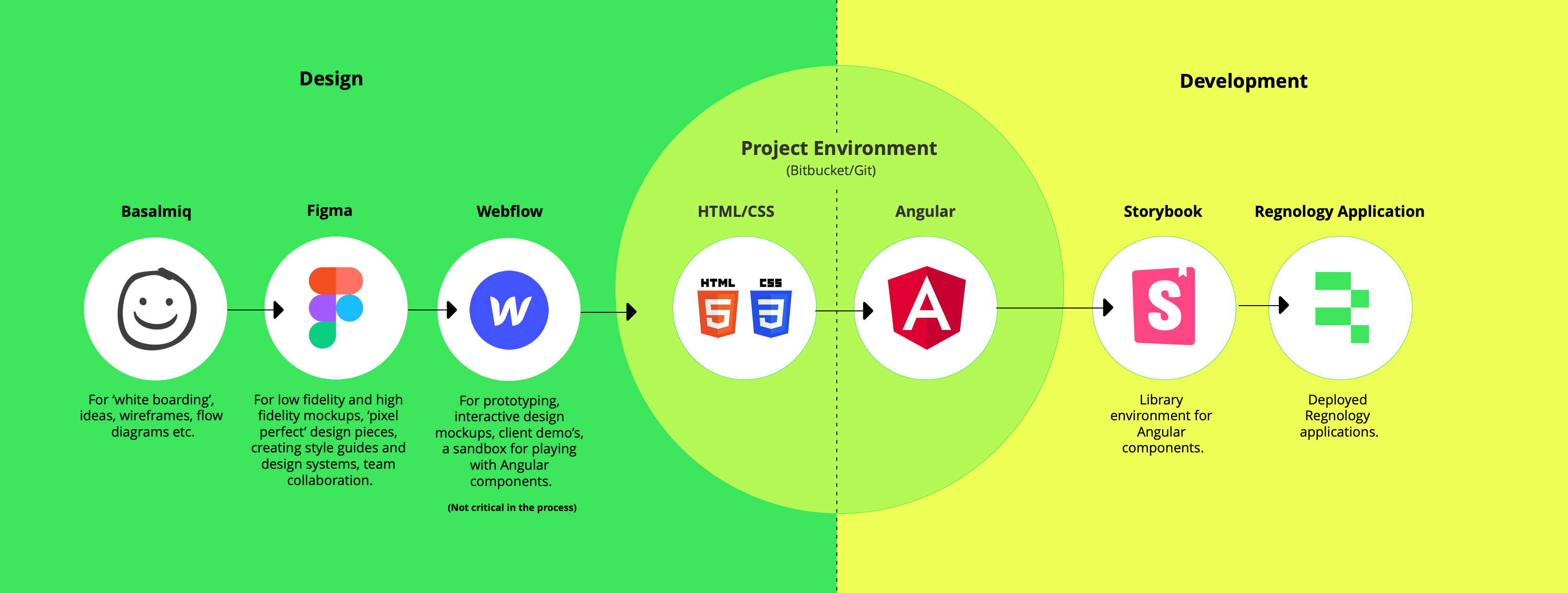
I began by using my whiteboarding tools to sketch the primary application structure, the app structure for the entire suite of applications that the company supports. These designs once tested and validated I moved quickly into Figma to break the structural parts into the pieces that I could create the individual components from.
I started with the navigation elements, the primary and secondary links. Then the various buttons and action elements, and the primary components, the grid and the form elements. As part of the initiative I designed and created the set of components to conform to the W3C accessibility standards, WCAG 2.2. A major part of the initiative was to create accessibility compliant applications. The individual design components formed the building blocks for the application elements that we pieced together to create the applications.
Once designed and developed the components were committed to Storybook to create our library. We had fixed on an Angular frontend framework so that the various development teams could piece the applications together 'like lego'. Individual styled components that the developers could use to create the screens. For the legacy applications within the suite of products, some on older tech stacks, we created a web component library in tandem with the Angular components.
The Component Library
Most UI components are not standalone. For a design system to work as it should it makes sense for components to be grouped into a single package...a component library. Stepping it up several notches, doing it once, the design and the development and using it 'many' is the way to go, avoiding duplication of effort and building into that work, at a component level, accessibility compliance and detailed tweaks based on feedback and contributions is several levels above merely supplying a style guide.
This is a component library designed to make life easy for the developers while creating a seamless user experience for the end user. Once upon a time, designers had to imagine, design, create, and maintain an individual user interface for each and every company product. Designing, building, and maintaining a UI for each and every individual digital piece of output is expensive, inefficient, and fraught with repeatable issues. Enter the component library. Modular UI libraries with matured considered styled and most importantly reusable components are a game changer. A library of common user interface components that power an organization’s complete portfolio of digital products.